This is a sample page showing the various native blocks and custom page flex contents included in this theme. It may be useful to reference later as a quick way to see how various items look on a page. This is the paragraph block, the most common element that will be used. Text may be bolded or italicized here as necessary, and it works much like any other word processor. Links can be attached to text as well.
Please take note that what you see in the editor is not necessarily a perfect 1:1 representation of how it will look in the website. Not all the CSS used on the front-end gets loaded in the editor. Remember to check and see how things look on the site when you make edits to a page!
Headings
Next let’s look at the headings. Here are the six different headings in descending order.
Heading 1
Heading 2
Heading 3
Heading 4
Heading 5
Heading 6
Remember, you can change the color and size of these individually. You should use whatever level of heading best fits the semantic flow of your document. H1 is almost always a page title and gets formatted automatically by the theme (at the very top of the page), h2 is for main page sections, h3 is for subheadings under h2 headings, h4 is for sub-subheadings under h3 headings, etc. With the exception of the above six examples, all the headings on this page are semantically correct.
Images
Images can be added, aligned, and captioned as needed. No Alignment / default alignment will set the image to the left edge of the content container and will start a new line after. “Align Center” will center the image in the page and start a new line after. These are the two most common alignments you will use.
Choosing “Align Left” or “Alignment Right” will ‘break’ the document flow – but not necessarily in a bad way! These last two alignments will allow other elements that come after the image, typically paragraphs, to wrap around the image. Just be mindful of the amount of text and the size of the image, as setting these floating alignments may have unintended consequences if the amount of text is too small to fully envelop the image.
Additionally, the size and and aspect ratio of the image may be controlled through the block settings. Setting an aspect ratio that differs from the image’s native aspect ratio does not stretch, compress, or otherwise distort the image. Instead it will effectively ‘crop’ the image when it is displayed on the page.
The image included inside this paragraph has the ‘Right’ alignment set with a size of “Medium” and an aspect ratio of 16:9. The image below has the “Centered” alignment and the default size / aspect ratio items..

Image Gallery
Image Galleries can be added too. By default they are just thumbnails; Add a link to an image in the gallery using the ‘Media File’ option to make them expand.




Cover
The Cover block allows you to have an image with text placed on top of it. This is an example of the Cover block. It includes an overlay to increase text readability, the opacity and color of this overlay may be adjusted in the block style settings.

Cover Title
Media & Text
The Media & Text block allows easy side-by-side presentation of an image and text associated with that image. You can use other blocks inside of this block.

Inner Heading
Media and Text Block Text Content
- Inner List Item 1
- Inner List Item 2
Lists
Lists are often useful for displaying content. There are two types of lists, ordered and unordered. Ordered lists are numbered sequentially. Unordered lists use a simple bullet point. You can use the ‘Indent’ option to create sub-items.
Unordered Lists
- Unordered List Item 1
- Unordered List Item 2
- Unordered List Item 3
- Unordered List Item 3 Indented Item 1
- Unordered List Item 3 Indented Item 2
- Unordered List Item 4
Ordered Lists
- Ordered List Item 1
- Ordered List Item 2
- Ordered List Item 3
- Ordered List Item 3 Indented Item 1
- Ordered List Item 3 Indented Item 2
- Ordered List Item 4
Quotes
There are two types of quote blocks with different styles that can be used for extra emphasis. Quote citations are included in both types of quote blocks.
Block Quote
Block quotes are the standard inline quote type.
This is a Quote block for a block quote.
Citation
Pull Quotes
Pull quotes are slightly larger, center-aligned, and have more vertical spacing on each side.
This is a Pull Quote block for a pull quote
Citation
Details Block
The Details block adds a quick expandable/collapsible item. These are useful when you want to show/hide an item but a full accordion isn’t necessary.
Outer Content of Details Block (Click This)
Inner Content of Details Block
Separators
A simple separator element is included. There are several two variants of it: Default, Wide, and Dots. Default is a half-width, wide is the full page, and dots is a set of three dots. They are shown below in that order.
White Space – Spacer Blocks, Padding, Margins
There is a built-in Spacer block that adds a fixed amount of white space. A 100px spacer is inserted between this paragraph and the next paragraph for example.
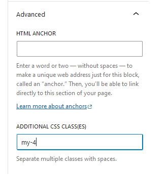
Using margins and paddings on individual elements is generally the best practice way of adding white space between elements, and this can be done by assigning a custom CSS class in the Block Settings > Advanced > Additional CSS classes. Padding creates blank space from the inside of the element and margin creates blank space from the outside of the element. There are 6 levels CSS classes for each to choose from starting from 0 (no margin or padding) and going up to 3rem (equal to 3 lines of text-height). Increased specificity for a single axis or a single side can also be used.
Padding Classes
| Level | All Sides | X-Axis | Y-Axis | Left | Right | Top | Bottom |
|---|---|---|---|---|---|---|---|
| Level 0 | p-0 | px-0 | py-0 | pl-0 | pr-0 | pt-0 | pb-0 |
| Level 1 | p-1 | px-1 | py-1 | pl-1 | pr-1 | pt-1 | pb-1 |
| Level 2 | p-2 | px-2 | py-2 | pl-2 | pr-2 | pt-2 | pb-2 |
| Level 3 | p-3 | px-3 | py-3 | pl-3 | pr-3 | pt-3 | pb-3 |
| Level 4 | p-4 | px-4 | py-4 | pl-4 | pr-4 | pt-4 | pb-4 |
| Level 5 | p-5 | px-5 | py-5 | pl-5 | pr-5 | pt-5 | pb-5 |
Margin Classes
| Level | All Sides | X-Axis | Y-Axis | Left | Right | Top | Bottom |
|---|---|---|---|---|---|---|---|
| Level 0 | m-0 | mx-0 | my-0 | ml-0 | mr-0 | mt-0 | mb-0 |
| Level 1 | m-1 | mx-1 | my-1 | ml-1 | mr-1 | mt-1 | mb-1 |
| Level 2 | m-2 | mx-2 | my-2 | ml-2 | mr-2 | mt-2 | mb-2 |
| Level 3 | m-3 | mx-3 | my-3 | ml-3 | mr-3 | mt-3 | mb-3 |
| Level 4 | m-4 | mx-4 | my-4 | ml-4 | mr-4 | mt-4 | mb-4 |
| Level 5 | m-5 | mx-5 | my-5 | ml-5 | mr-5 | mt-5 | mb-5 |
Tables
Above are two examples of the ‘Table’ block. These tables have optional header and footer rows, and may be assigned responsive column widths or fixed column widths. The number of rows and columns is completely customizable. These are great for displaying tabular data, but should be avoided when building layouts.
Buttons
Buttons may be added with styling pre-applied. The button block creates a ‘group’ of buttons, with one button by default, which you can add more to as needed. The ‘group’ can be set to display as a row or a column. Links can be added the same as if it was simple text.
Columns
Sometimes you may want to build more advanced responsive layouts. The ‘Columns’ block is useful for this. Any blocks may be used inside of a columns block. It comes with several different pre-configured layouts. 33.3%/33.3%/33.3% is shown below. Try re-sizing the browser to see how this collapses.
Col 1
Lorem ipsum dolor sit amet, consectetur adipiscing elit. Suspendisse a lacus rhoncus, varius nisi non, ultricies lorem. Fusce nec nisi rhoncus, pretium velit nec, feugiat magna. Curabitur auctor, lectus vel mollis laoreet, velit leo vestibulum lectus, eu ultricies orci sapien sit amet mi.
Col 2
Proin ac ipsum sed libero vehicula sagittis. Maecenas vehicula leo faucibus sem efficitur venenatis. Vivamus quis luctus magna, congue egestas purus. Ut congue nisi et justo tempus pellentesque. Morbi erat tortor, tristique et pharetra ut, elementum id tellus. Donec finibus cursus mi, id imperdiet libero dignissim id.
Col 3
Sed eget luctus felis. Nullam vestibulum efficitur risus sit amet elementum. Donec posuere velit quis ipsum finibus, quis aliquam sem tristique. Fusce ac arcu placerat, ullamcorper turpis vel, volutpat enim. Donec a risus fermentum, dapibus nulla id, ultricies mi.
Rows
Default HTML behavior is to create a new line for each element. Sometimes you may want to have in-line content all in a single row. The ‘Row’ block is useful for this. Any blocks can be used inside of a row block.
Row Item 1
Row Item 2
Row Item 4
Row Item 5
Combining Layout Blocks
You can combine Column, Row, and Stack blocks to create complex grid layouts.
Page Flex Content
Underneath the default Block Editor you’ll see an additional section called ‘Page Flex Content’. This section contains more advanced pre-built layouts that can be configured as needed.
Please note that anything added from the Page Flex Content area will appear underneath this default block editor content. A ‘Text Block’ Page Flex Content block is a miniature instance of the WordPress Classic Editor, and may be used to insert basic content (headings, text, images, lists, etc) below a Page Flex Content item.
Accordions
Collapsible Accordion blocks may be added through the Page Flex Content. Add a new Accordion layout by clicking ‘Add Body Element’, selecting ‘Accordion’, and then click ‘Add Row’ to add each individual accordion item within that layout. You can link directly to an accordion item on a page by appending a pound sign and the accordion item’s ID. This is the “Accordion Title” field, but with hypens replacing spaces.
For example, an accordion on this page with an “Accordion Item 1” title would have a direct link: https://facts.psychiatry.uw.edu/blocks-sample-page/#accordion-item-1
Accordion item 1 inner content. This can be anything that is possible to add through this text box editor.
Accordion item 2 inner content. This can be anything that is possible to add through this text box editor.
Accordion item 3 inner content. This can be anything that is possible to add through this text box editor.
Accordion item 4 inner content. This can be anything that is possible to add through this text box editor.
Page Tiles
The ‘Page Tiles’ Flex Content Layout is shown below. You can add any number of tiles to this. Images and text are customizable, and links may be added to each tile item.
Footer Elements
There are two additional Page Flex Content items specifically for the footer. Both are shown here, but you will generally only want to use one or the other.
The first is the ‘Feature Block’ element. This is a single page-spanning element that allows an image background, title, text-body, link, embedded video, and a customizable block color.
The second is the ‘Column Group’ element. These are simple images with links attached under a title.
